OTC
branding

One Touch Container (OTC) is an innovative enterprise in the field of logistics and the environment, developing multi-purpose containers for transporting goods in a smart, efficient and sustainable way.

In the project, I focused on creating a brand language that connects technology, sustainability, and globality — a combination of precision engineering with a human perspective that speaks of responsibility, flow, and continuous innovation.

Goal: To redefine what the future of sustainable logistics looks like.

The Designing process

Logo

The logo was designed from the concept of movement, connection and continuous flow – values ​​that represent the principle of reuse and the ease with which the product moves from place to place, from country to country, with just one touch.
The letters O.T.C are designed
in a uniform and continuous line, representing circularity and operational efficiency – just like the container itself, which can be opened, closed and transported with one touch (“One Touch”).

Fonts

The graphic language developed continues these values ​​— with modern, spacious, and clear typography, and with the use of contrasting shades of green that emphasize a balance between functionality and advanced design. This is branding that speaks a new green industrial language:
efficient, responsible and smart.

Colors

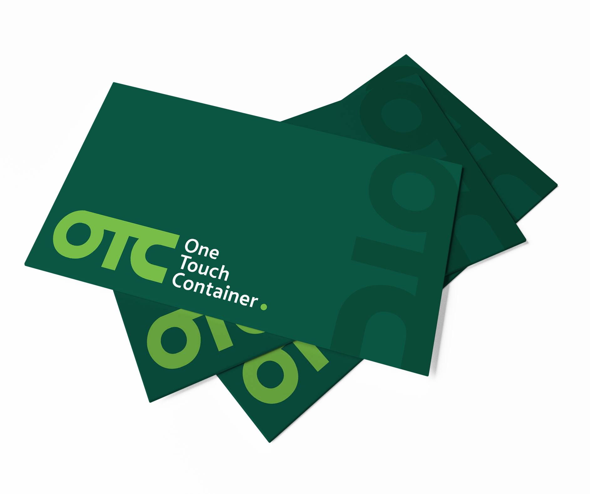
The deep green color conveys trust, sustainability, and an ecological solution, while the light green adds liveliness and innovation a combination of industry and nature.

The final dot after the brand name symbolizes precision and completion of the cycle of action, like the end point of a conveyor belt.

#535452

#7bc248

#044c39

Information brochure

250-250

2023 © All rights Reserved to Inna Levin. Design by Elementor