Kendoo
branding
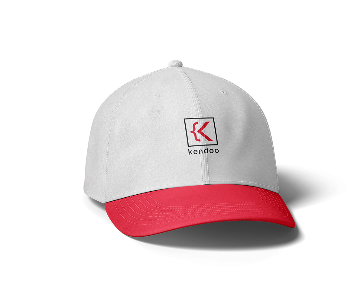
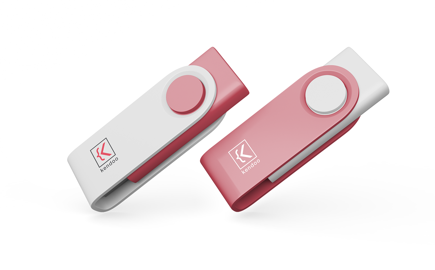
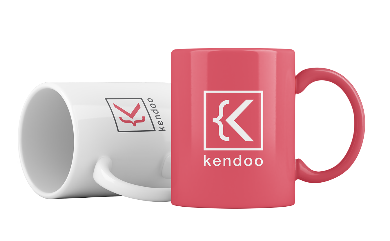
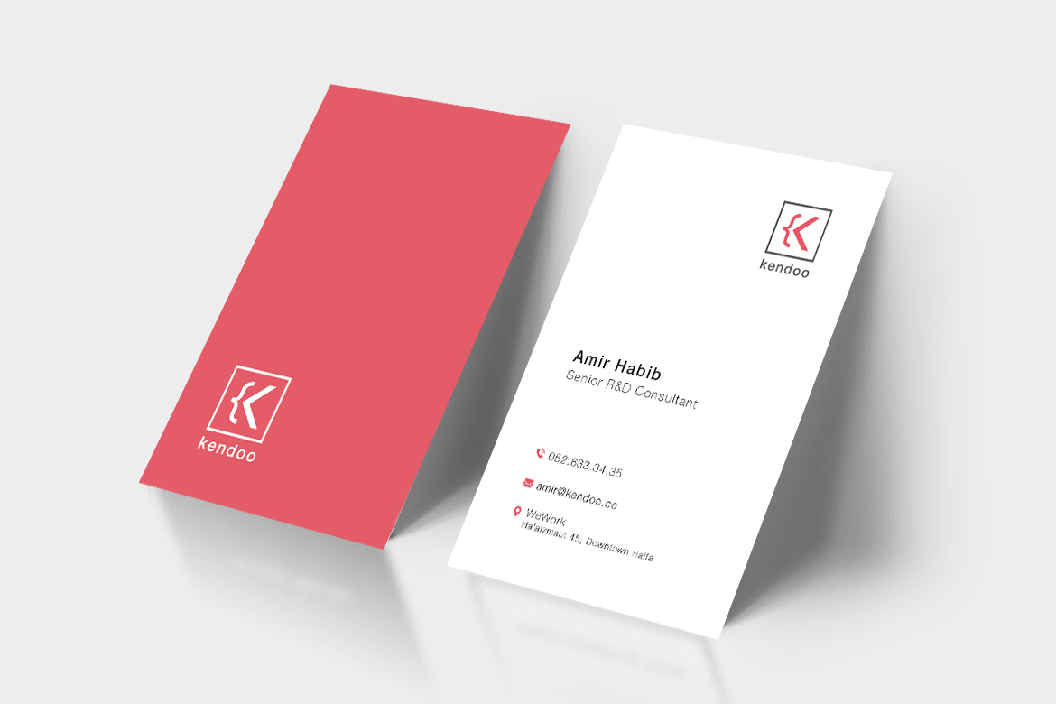
Kendoo is a technology consulting and organizational development company dedicated to helping organizations operate at their full potential in an ever-evolving environment. The brand is built around the idea of agility, clarity, and the power to create meaningful change. Even the name Kendoo resonates with the spirit of “Can-Do”, reinforcing the company’s belief that anything is possible with the right mindset and tools.
The visual identity expresses this philosophy through a modern, structured, and technology-oriented design language that aligns with the company’s mission of achieving operational excellence and navigating complex digital ecosystems.
The Designing process
Logo Concept
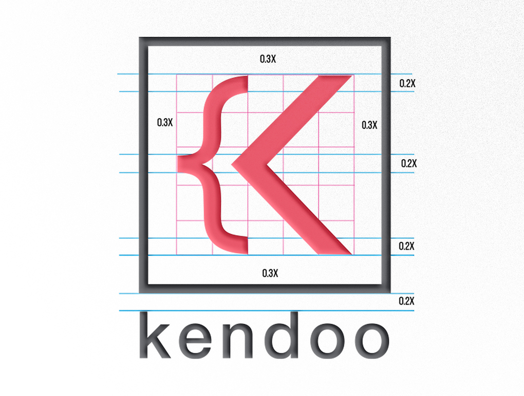
The Kendoo symbol is derived from curly brackets { }, a fundamental element in programming languages. In code, brackets define logic, order, and priority — a metaphor for Kendoo’s role in creating structure and clarity within organizations.
The result is a clean, geometric icon that captures the brand’s essence: logic, innovation, and a forward-thinking mindset.
Typography
The primary typeface is Helvetica Neue LT Std Medium, chosen for its clarity, timelessness, and high legibility.
Its geometric precision echoes the brand’s connection to structure and logic, while its neutral tone ensures that messaging always appears professional, accessible, and grounded.
Color Palette
The brand uses a refined two-tone palette that combines professionalism with a modern edge:
Pantone P 172-13C — A warm coral-red, used as the primary brand color. It reflects energy, proactivity, and a human-centric approach within a technological environment.
Pantone P 59-13C — A soft neutral tone that balances the palette and creates visual harmony.

